A Guest Post by Michael Toye
I am a firm believer, at least with photography, that what you get back is directly related to the effort you put in. As with all activities, it’s certainly not linear and I am the first to admit that you can tip the scale in your favor to achieve some great architectural images armed with only a few basic techniques.

For me, I think the allure of shooting buildings started as a tourist. We all do it, albeit some with less style and grace than others – yes you leaning tower of Pisa holder up’ers, I am talking about you! So there you are, standing in front of an awesome and aged icon of a building and with little thought other than fitting the structure into the LCD’s frame, you snap away. I know I did. The problem is that the hastily captured image is more than likely just going to be just that, a snap.
I have a mental checklist i go through when i pass a building that catches my eye, so the following techniques apply to all aspects of photography really but, specifically for architecture, you will see significant improvement.
Why?

Most of the time this question of why you are going to take a picture or rather what caught your attention will be obvious. It’s pretty simple when your building is freakishly tall, like Canary Wharf Tower in London, or a pier that stretches to the horizon which, in the UK, would be located in Southend. I know you all are thinking this is a little bit redundant, but far from it. Consciously visualizing what you thought interesting about this particular building will help you work out how to compose a shot to capitalize on that feature.
Features aside, there are a couple of basic errors to avoid; keep horizons and horizontals level, verticals vertical and ensure the image is sharp. You might disregard some or all of these, but always initially frame with these in mind because no image looks more unprofessional than a wonky or blurry one!
The most used compositional styles employed by architectural photographers will be one of the following.
Leading Lines

Perspective and depth are the usual drivers for leading lines, but the more obvious definition is a scene that directs the viewer’s gaze along an intended path. The elements in the image above – escalator, grooves in the roof and wall and the ‘ladder‘ in the distance – all lead your eyes up and toward the exit. The curvature of the ‘grille‘ in the roof serves as the final area of focus. My intention with this image was for the viewer to participate in a small journey. I also chose this perspective, with the distorted view of the escalator, to provide the viewer a sense of scale; especially relevant as most will not have visited this particularly grand London Underground station.
Dominant Facias

This building is pretty ugly and it is closely surrounded by other non complimentary buildings… apart from this elaborate design on the front of Moorfield’s Eye Hospital. There is so much glass in the balcony and facia, the light play is amazing. Another compositional element that everyone bangs on about, and quite rightly, Rule of Thirds; the invisible tic tac toe shaped grid where you place objects of focus along its lines and intersections. Well it works! You should always consider it when framing a scene, even if you decide otherwise.
Specific Detail(s)

I love spiral staircases. They are an awesome detail in buildings and a contrast to the usual straight lines and angles found in architectural images. This one is in Queen’s House in London. There’s very little context here apart from the stair case itself. You have no idea where it is or what the rest of the building might look like.
The Contextual Environment

These doorways connect adjoining rooms in a family dormitory. This building, amongst others, is to be found in Kolmanskop, Namibia. A long since abandoned town that served the families and workers at the local diamond mine. The sands of the Namib desert have invaded all of these houses and, along with the peeling wallpaper, frames, and faded walls contribute to a real sense of their abandonment.
Symmetry

I chose this straight down the line composition, at London’s Natural History Museum, to give a real sense of depth. The power of the image is in the symmetry and off horizontals and verticals would have a serious impact.
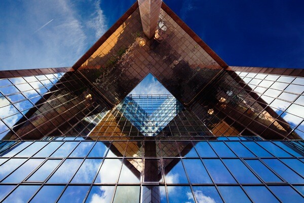
Oh yes, and remember to look up!

Michael Toye is a professional photographer, based east of London in the UK, specialising in architecture and landscape. You can follow Michael’s images on his blog or contact him on Facebook.
Table of contents
Architectural Photography
- GENERAL
- PREPARATION
- SETTINGS
- LIGHTING
- COMPOSITION
- Photographing Buildings [Composition Tips]
- GEAR
- ADVANCED GUIDES
- CREATIVE TECHNIQUES
- POST-PROCESSING
- INSPIRATION
![Photographing Buildings [Composition Tips]](https://i0.wp.com/digital-photography-school.com/wp-content/uploads/2012/09/photographing-buildings-2.jpg?w=600&h=1260&ssl=1)


Some Older Comments