Creative Color Processing (Part 2/3 – Split Toning)
This is Part 2 of a 3-part series on creative color effects using Lightroom 4. In Part 1 of the series, I discussed shifting White Balance either warmer or cooler for creative effect. In this article I will explain Split Toning, and also give you some ideas for using creative white balance and split toning together for even more color control.
For this image, I used split toning to complement the autumn foliage by adding red to the shadow areas:
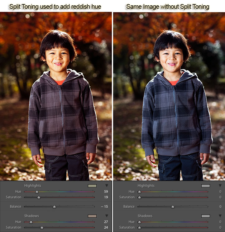
While white balance affects the entire image, split toning allows you to treat the shadows and highlights differently. You can add one color to the shadows and a different color to the highlights, and also control the balance between the two.
In processing this scene of a street in Tokyo I used split toning to add blue to the shadows and yellow to the highlights:
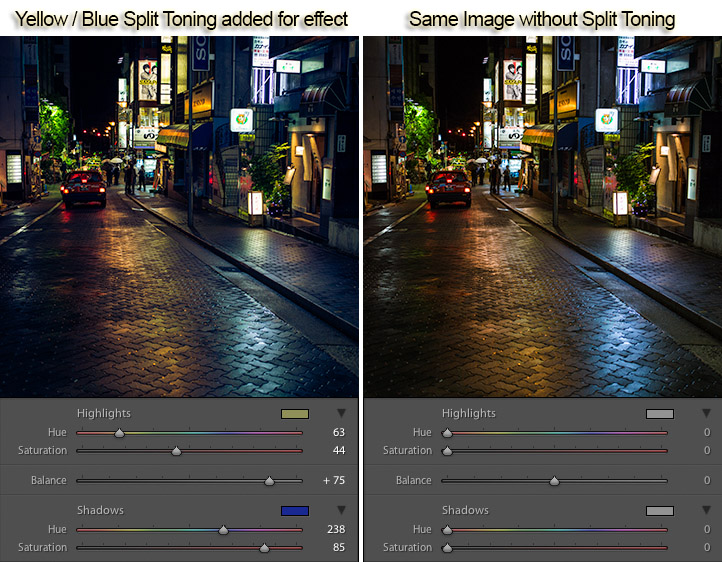
Split Toning can also be combined with white balance for creative effect. In the photo below I used a cool 3500 kelvin white balance, and then used split toning to warm the skin tones by adding yellow to the highlights. The result is cool-toned image, without unnaturally bluish skin tones. In this way, white balance and split toning can be used together to create an effect that would not be possible with either tool on its own.
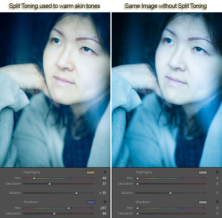
Creative color processing is very subject, and ultimately comes down to personal preference. Even if you don’t really like the editing decisions I’ve made in these sample photos, I hope I’ve inspired you to try some new techniques for creatively processing your photos. I appreciate feedback, please comment below or feel free to connect with me through Facebook or Google+.
This concludes Part 2 of my Creative Color Processing series. In Part 3, I will show you how to use the Tone Curve tool to control the red, green, and blue color channels separately.


11 Responses to “Creative Color Processing (Part 2/3 – Split Toning)” - Add Yours
December 21st, 2012 at 6:24 am
Good tips Jason,
I see how useful this could be for cool special effects.
For natural shots it seems like the emphasis should be on keeping the photo natural in the same color tone as the eye sees it.
December 21st, 2012 at 9:38 am
Thank you
December 21st, 2012 at 11:54 am
Thanks for this. Articles about split-toning always seem to be in relation to B&W conversions – I’ve never seen an article where you could use the process to tweak colour images. I’ll definitely have to keep this in mind in the future.
December 21st, 2012 at 7:57 pm
Some useful insights here again Jason. I particularly loved the first and last examples. Thanks for sharing!
Cheers
George S.
December 21st, 2012 at 10:57 pm
I didn’t use to edit my photos my since a few articles I’ve read, I’m kinda into processing images now…
Always useful!
December 22nd, 2012 at 1:10 am
Jason, thanks! I recently was shooting through glass at a LSU. The light was flat and lifeless, the added haze from the glass flattened the color even more. White Balance only solved part of the problem, warming the scene. Using Split Toning I was able to bring out the tigers amazing color, like your first example.
January 11th, 2013 at 4:06 am
In regards to the balance, what does the +/- refer to? Ie, if the balance is positive does that “weigh” the shadows more?
January 11th, 2013 at 2:29 pm
Thanks for the comments everyone!
Robl – yes, I used to only think of split toning as a way to add a subtle tint to bw conversions. It was a while before I thought of using it for color effects.
Matthew – thanks for sharing your image! That’s a great use of split toning. I also use it that way to help restore color when glass or haze in the air impacts the image.
January 11th, 2013 at 2:34 pm
Hi Linda,
The balance controls where Lightroom “decides” the shadows stop and the highlights begin. So in the example of the rainy street in Tokyo where I’ve set the balance to +75, the yellow tone in the highlights effects a much broader tonal range than the blue. In other words, most of the images gets a little bit of yellow tone, but only the darkest areas of the photo get the blue. If I pulled the balance to -75 for example, most of the image would look blueish, with only the brightest portions getting the yellow.
I hope that explains it a little better, please let me know if that helps.
January 12th, 2013 at 4:53 am
Great explanation, thanks!
January 24th, 2013 at 5:49 am
Absolutely love the techniques and the effects they have on the photograph… I am a novice and posts such as this are very helpful. Thanks for the hard work.
Leave a Reply