Working with Gradient Maps: Photoshop Creative
When you’re looking for a fun effect to add to an image, the Gradient Map tool might be just the ticket.
The Gradient Maps tool has a serious side in creating custom black and white conversions and a more frivolous one in adding color to an image. I’ll show you how to use it for both purposes.
Before we start a word about how the Gradient Map works. It is an adjustment so you can find it on the Adjustment menu and you can also apply it using an Adjustment Layer. It applies a gradient of color to your image depending on the tones in the image. So, where the image is darker the tones at the left of the gradient are applied and where the image is lighter the tones at the right of the gradient are applied. The midtones are colored with the color in the middle of the gradient. If you want the effect reversed, you can reverse the gradient and the colors are applied in reverse.
The serious side of the Gradient Map tool is its black and white gradient. You can use this to convert an image to black and white. By changing the gradient, you can affect what parts of the image go to black and which parts go to white.
Step 1
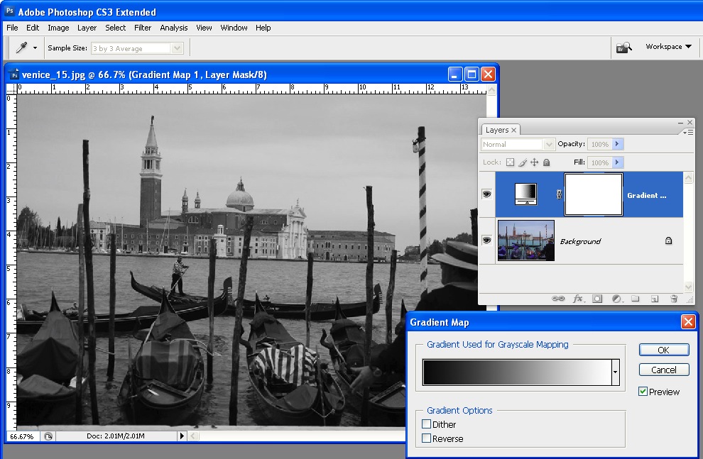
To see this at work, open an image and add a Gradient Map adjustment layer by choosing Layer > New Adjustment Layer > Gradient Map. From the Gradient list choose the Black, White gradient and click Ok. The image now shows as black and white.
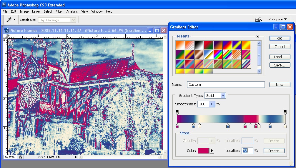
Step 2
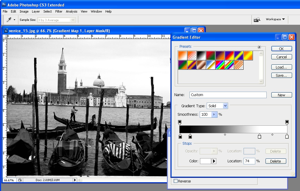
To adjust the way the gradient is applied, double click the adjustment layer and double click the gradient to open the Gradient editing dialog. You can now add stops below the gradient bar to adjust how the colors are applied. For example, if you add a second black stop to the right of the first one, you can set all the tones that are mapped to this area of the gradient to black rather than them ranging from black to a dark grey.
Step 3
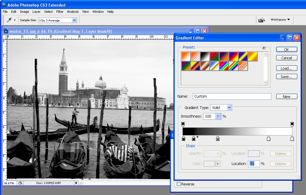
By adjusting the midpoint marker between two stops you can control how the gradient transitions from one color to the next. If you drag it to the left you steepen the transition from the left most color to a color that is half way between the colors in the stops either side of the midpoint marker. Of course, here we’re talking about black, grey and white as colors, but in a minute the stops will be applying colors to the image and they work the same way.
Step 4
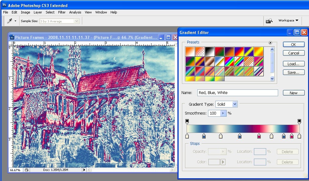
To apply a color gradient to an image to give it a more creative look, repeat step 1 to open an image and to add a Gradient Map adjustment layer to it. This time choose one of the colored gradients. If the gradients aren’t to your liking, click the flyout menu on the Gradient tab and load a second gradient set and use one of those.
Step 5
These gradients, like the Black, White gradient can be edited so you can tweak the colors or add new ones until you get exactly the effect you want.
Step 6
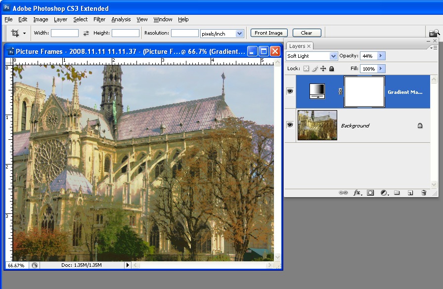
Like any adjustment layer, you can achieve further creative possibilities by setting the blend mode of the adjustment layer to something other than Normal. You can also reveal some of the underlying color from the image if you reduce the layer opacity.


14 Responses to “Working with Gradient Maps: Photoshop Creative” - Add Yours
January 24th, 2009 at 2:18 am
Nice tutorial. I was pretty unfamiliar with gradient maps, so this cleared up some fog and gave me a new tool to work with. THANKS!
January 24th, 2009 at 3:21 am
fantastic! i really do learn something every day from DPS. thanks, Helen, for a very clear explanation.
January 24th, 2009 at 3:42 am
Thanks for the tutorial! This was a feature I was completely unaware of. I love finding out what else is in the depths of Photoshop!
January 24th, 2009 at 5:27 am
this isn’t the best example of gradient used as it’s very edgy and hard, with lots of colours. try using 2 colour blened gradients.
you can also achieve great contrast in your photographs by making a black and white gradient map layer adjustment, setting it to overlay then lowering the opacity until it suites you !
January 24th, 2009 at 6:07 am
Either this is a feature I skipped for my Adobe Certification, or something that I’ve simply forgotten how to use. Thanks for showing the rest of us the value of the gradient map.
January 25th, 2009 at 11:53 am
Really cool article! I love the gradient map and how it can render B&Ws as well as some color, in images. It kind of reminds me of a duotone.
Ken
January 26th, 2009 at 7:44 pm
tnx helen…i was enlighten
January 29th, 2009 at 11:23 pm
Camera Raw in the new CS4 has a really easy to use gradient tool.
January 29th, 2009 at 11:51 pm
very hepful tutorial especially in converting image into BW…thanks very much…..
January 30th, 2009 at 8:01 am
Thanks for this, it helped me produce this.
February 2nd, 2009 at 9:00 pm
Great little tutorial. I never considered creating b/w with gradient maps. I gave it a go and the results were wonderful. I’m definitely going to keep using this technique.
February 3rd, 2009 at 2:18 am
I love using gradients for my black and whites. However, I have found that digital black & whites (whether thru gradients or removing color or ‘black and white’) tend to turn out blu-ish – this is not optimum.
I have found that after the black/white gradient, I create a hue adjustment layer and colorize it to a sepia. Then, I bring down the opacity to my own liking – this outs the blu-ish tint. Since I get to set my own ratios, my photos are uniquely my own brand of black and whites. I stumbled upon this technique after reading one of the DPS blogs! Thank you!
February 4th, 2009 at 8:35 am
Wow. Thanks. I finally got the picture
There are so many uses for this. I like the overlay approach for contrast. But it also made me think of other types of overlays. For instance a two color gradient could give could give you a duotone over a black and white or a split toning effect over color. I think this will quickly become a staple of my photo processing.
Jackie – some thoughts about your bluish black and whites. I’ll bet if you were to print your black and white out at a lab it would really be b&w. Two things could be happening. If you’re looking at a print, your printer may have a calibration problem. Or your monitor may have one if its your screen that seems blue. Most monitors tend to have a bluish cast, and laptops are especially bad. This is why monitor calibration is so important.
March 5th, 2013 at 6:28 pm
Hi, I have a problem. Then I apply a gradient map and make and adjustments on the picture lets say reverse on gradient options. IF somebody will take the same saved and adjusted image and use Photoshop with same gradient option “reverse” they would undo all my work and true picture will emerge> is there any way to prevent this “unmasking” ?
Leave a Reply