While it’s true that photography is a visual medium, I am always fascinated by images that can suggestively invoke my other senses. Have you ever looked at a photo in a cookbook or magazine and commented that the food looked so good you could practically taste it? What really pulls me into the essence of a photograph, though, is texture. Whether I’m feeling colorful autumn leaves crunching under my feet, the delicate edges of flower petals on my fingertips, or the jagged shards of a broken window– when a photo makes me want to touch it you have me hooked. That’s probably why I’m such a sucker for texture and why I strive to include it as a design element in so much of my photography. I want (or is it need?) these images to speak not only to your eyes, but to as many of your other senses as I possibly can. I want them to speak to your heart.

1/80, f/5, ISO 250
One of the first things to consider when photographing texture is that the beauty is in the details. While the deserted hallway of an abandoned building can evoke a strong sensory response, it’s filling the frame with a broken window or rusted pipe from the deserted hallway that’s going to really bring your textures to the forefront. That’s not to say that the deserted hallway doesn’t have its own story to tell, but this is not the time for cramming as many elements as you can into the frame. Keep it simple.

1/250, f/8, ISO 400
As with just about everything we do as photographers, lighting is crucial in accurately and effectively creating a both visual and textural experience for the viewer. The three characteristics of light– color, quality, and direction– are just as defining when highlighting textural elements as they are when photographing people, landscapes, or any other subject. While it is difficult to separate the three, I find that quality and direction of light tend to have the most impact on photographing textures– accentuating them, rather than overpowering them. Generally speaking, soft, cool lighting will enhance softer, smoother textures like ice or water, while hard side-lighting will not only bring out the detail on that rusty pipe or stone statue, but elevate it as a tactile experience. Ambient light almost always works best, providing a more organic, natural feel.

1/100, f/4.8, ISO 100.
Remember that when you are shooting for texture, your model isn’t going to get bored or tired. Your child is not going to get all fidgety, wondering about the ice cream you promised if they sat still for a nice picture. The only timing issues you have to deal with when shooting texture are your shutter speed and how long your ambient light is going to cooperate. As result, you usually have the luxury of taking your time. Experiment with your composition. Play with your angles. Adjust your camera settings, then adjust them again. Your available light may be your primary tool in these scenarios, but you still have to able to make sure that your camera sees the scene the same way you do. Your digital camera is nothing more than a computer with a window on it. It has no opinions or artistic intent. You have to tell it what you are seeing, so play with your shutter speed and aperture. See where they take you.
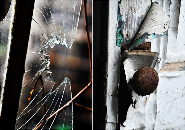
Taken at an abandoned prison, the broken glass and decades worth of peeling paint not only tell a story, but evoke an almost physical reaction. Both shot at 1/250, f/5.6, ISO 640.
Obviously, a certain amount of personal taste and preference come into play, but I tend to use smaller apertures when shooting textures. Shooting wide open and its resulting depth-of-field, can throw parts of your image out of focus– something I want to avoid when photographing texture, simply because textures will no longer look as they should when out of focus. I will, however, use wider apertures if I am including any background elements. Just as with a portrait, an out-of-focus background will place added emphasis on my subject and foreground– emphasis which will significantly enhance the textures in the frame. Try bracketing your exposures until you get the desired results.
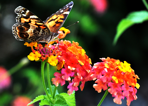
In the examples below, I did go with wider apertures because of the background elements. For the cookbook shot, we needed a clearly defined background in order to really emphasize the texture of the ingredients. Blurring out the background behind the butterfly in the next example gave more definition to the textures of the wings and flowers.
1/80, f/5.6, ISO 400
1/250, f/5, ISO 200
For the sunflower, however, notice that there are multiple textures on the same visual plane. Since I was working with a mostly solid, dark background, I wanted to make sure that every element– as well as all three textures– was in focus, which meant going with a smaller aperture.

1/250, f/5.6, ISO 100
Texture is such an interesting and effective design element because it provides visual cues that allow the viewer to put your images into their own context. It gives them something they can relate to. If your photo truly speaks to them, this is one of the reasons why. You’ve given them something that helps make it their own. By capturing the texture, you’ve captured at least part of the essence– and it doesn’t get much cooler than that.

