The Hues and Use of Colour, Part III
Seek the strongest colour possible…the content is of no importance.
–Henri Matisse
Upon review of our last entry we learned that the colour, tone or shade of a perimeter colour can, and does, affect the primary subject. The works of the artists identified —Turner, Maisel and Meola — amplify this notion without reservation.
In many cases a specific colour is also very responsible for controlling our subconscious. When we think of white we translate our thoughts to purity and objectivity. Red is for romance, yellow of jealousy, and green for a pristine environment. At the same time we can look at the colour black as a flat monotone that is suggestive of death; paint that same uninspired black with a wash of high gloss varnish and it immediately takes on a feeling of high-class and being formal. Blue is the most popular and preferred colour by adults in North America.
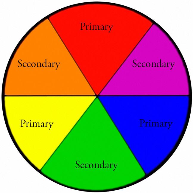
A Basic Colour Wheel showing Primary and Secondary Colours
An advertising executive once told me colour sells, the right colour sells better. It is not by accident that we instantly identify a specific red with Coca-Cola, yellow with Kodak or National Geographic, HP and IBM with the use of blue, and green by Fuji. These colours were not selected by accident, and reinforces the notion that colour does have a very profound effect on how we view an image.
If we think of the colours of Coke and Kodak and IBM, we instantly associate these corporate colours as being a bold red, yellow and blue respectively. These are primary colours, from which all other colours are made. If we were to mix an equal amount of two primary colours, the result would be the secondary hues of orange, green and violet. And so it continues, and millions of colours are possible by mixing variations of these three primary colours.
Review illustration two, and see the effect the perimeter colour has on the red square in the centre. Against the black background the red stands up and offers an illusion of brilliance and strength, whereas when bordered by green the red really comes to life and is vibrant and happy. Meanwhile when surrounded by orange there is no contrast and the red square appears as, well, blah! Introduce violet as a neighbour and it simply kills that once vibrant and full of life little red square.
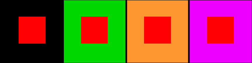
Illustration 2
That is all fine and dandy but what does it mean for the beginning photographer?
Much, and if you remember the basic principle of colour theory you will see yourself moving around the landscape more than ever looking for the complementary colour to support that of the subject. In so doing your final result will have more contrast and impact and you will more often than not be rewarded with the ‘wow’ factor.

This autumn scene near Peggy’s Cove, Nova Scotia is not overly exciting but provides a good example of colour theory in practise. If you cover the bottom half of the picture you are left with a secondary coloured orange foliaged tree and violet coloured sky, and the scene completely lacks any attention grabbing detail. Next cover the top half of the image; although the bottom half of the scene, although much less interesting than the picture as a whole, has far more impact due to the primary colour of yellow being surrounded by the primary colour of red and thus supporting the point of Matisse as quoted at the opening.
There have been many textbooks written on colour theory, and the science of the colour wheel dates back to at least the time of Newton. Personally, my curiosity is aroused when I am out making pictures, all I have to remember is that opposite colours attract, bordering colours repel. Too easy; now get out there and make some great pictures.
And remember, if you are having fun you are doing it right!
See the Full Learning to See Series
- Learning to See – Part 1
- Learning to See – Part 2
- Learning to See – Part 3
- Learning to See – Part 4
- Learning to See – Part 5
- Learning to See – Part 6
- Learning to See – Part 7
- Learning to See – Part 8
- Learning to See – Part 9
- Learning to See – Part 10
- Learning to See – Final


Some Older Comments